Hi, I’m Zac Johnson and Welcome!
Over the past 25 years, I’ve been making money online through various internet-based businesses, which focus on affiliate marketing, content creation and SEO — all while helping others learn how to do the same.
Through this site, you will find a collection of my latest content, projects, podcasts, interests and more.


Have we met before?
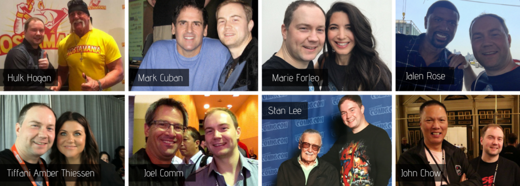
Making it in the world of online marketing and business is all about connections and providing value. Thanks to social media and the internet, this is now easier than ever.
Let’s connect and see what opportunities arise!